Friday, 11 December 2009

Christmas By Colour


Build Your Own Chicago


Tom Gauld


Characters from an Epic Tale. Postcard


www.cabanonpress.com

Sunday, 22 November 2009

Bio Diversity


I love the juxtaposition in these pieces of work. My favourtie is defnitely the Wireless Ginko. The artist creates symbols and images that represnt our modernity but he uses something of nature to create them. Leaves which represents nature are being used to represent something that is urban and perhapsm not so environmentally friendly.

You Are Here

An Umbrella design which is made to look like the "you are hre" symbol" on city maps. If looked at from above, ( birds eye view ) it looks exactly the same as what you would see on a map.

The Urban Forrest project


I think these posters have immediately communicates to its audience with a high impact. I recognise straight away what the posters are about.

This is a great example of the use of visual metaphor. In the first image, a falling tree is being represented by the set of barcode and this is a metaphor for comsumerism dertroying the forrests. I think similar things apply to the sencond poster and perhaps the third one.

I think that in the third image, the image represnting the meaning of "mother" also represnts nature and that is the use of a visual synecdoche

Japanese Barcode Design


"The Studio demonstrates the creative ways the barcode can go from basic to engaging with a few simple additions, revolutionizing the iconic information tag."

All that needed to be done were extend, shorten, and draw in simple illustratios and this is thew outcome. I'm not sure whether these will actually be put to use but it is a great rebranding and turning something really mundane into something interesting.

Roadsworth (Peter Gibson )


The artist uses stencils to adapt the existing road graphics, mainly on the streets of Montreal, initially as a protest against the lack of cycle lanes, but increasingly as a commentary on car culture, oil dependancy and authoritarianism.
I like the use bold stencil imagery to represent the underlying issues. By collaborating his work into something that is used every and directly associated tot he subject I think that the artist communicates the message effectively. The use of visual metpnym with the plug, ammunitions and etc is also applied

Christopher Goodwin

MasterMind


this is an advertisment for hotel Beau-rivage in the USA

"The idea was to create a refreshingly tranquil oasis for the weary passenger, mimicking the cool water of Beau Rivage’s tropical pool. The baggage belt was transformed into a swimming pool complete with swimmers and playful slogans. The result was a total change in how people react around the hectic space of a luggage belt."

Topos Design


This is a project was commisioned by the New York Magazine the feature the articale " The Facebook Revolt ". This was a manipulation and re-indentifying the generic Facebook face.


The designer uses a visual Metonym of the well know facebook image (white siluatte on a light blue background ) to represent the article about the website. The image is easily recognisable by any Facebook user but altered to suit the content of the article

MTV type


This is a typogrpahic illustration created for MTV 1. I thought that the luminated and silluetted letterforms on a plain black background is really effective. The urbanistic choice of colour reprersents the musci industry well. I think the perspective lighting also gives the illustration an energetic feel and somehow makes these typogrphic work seem musical.

Studio Volk 2


Illustrations for Radio Citta' Futura which is an Italian radio station. The illustrations are two portraits created in the style of a city map.
The designers uses a visual metaphor to associate the radio station to the city,
the tagline of the city: 'The city of sounds, the city of words' is wonderfully represents by these two illustrations

Studio Volk


This project was the annual report of University of Rome-School of Architecture.
The University is situated in an ex-slaughterhouse.

The design included wrapping the report in a polystirene plate covered in cling film which what meat usually comes in when you buy them. The designer uses a visual metonym buy using the packaging the refer to the fact of the location of there university. The report which is done in pink would be the visual metaphor of the buthered meet.


Friday, 20 November 2009

GOLD: Camilla Rojas


Gold is part of an installation series created to expose audiences to a particular idea through the power of typography and demonstrate how it could communicate and represent outside of the usual screen and print based forms.

Gold is a piece that criticizes a very popular fast food company and the huge obesity problem faced in our society. This piece was created by using the popular golden French fries spelling the word gold.

The word gold has different meanings in this, it portrays the main colour of the logo of the company being criticized. Also, the colour used ot descirbe fries (golden)

This is a juxtaposition of words and its context. The word gold is spelt out by pieces of french fries. In this project, the fries are being used as a visuak synedoche ( frieds representing junk food ) and i believe that it can also be a visual metonym

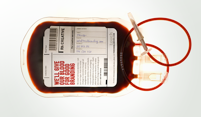
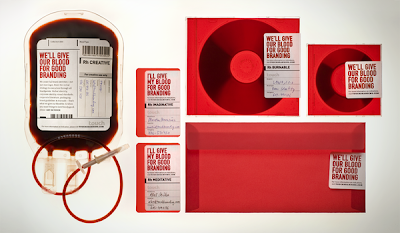
Touch Branding


Touch branding created this identity, to send out a message that " every point of communication is a chance to advertise (our) the company".

The identity is a direct mail in a form of a blood bag which is personally delivered to creative directors in ad agencies in Prague

This is a matophor with the designers saying " they would give their blood for good branding "

The word play is being presented by something physical and visual gives it a very high impact to the audience. There is also an element of shock in this project. I think that the concept of this is appropriate to the art directors who see a lot of designs as they work in a creative industry and would be looking to be shocked. I think that these mailshots do a good job.

The layout and format of the additional products such as CD's, business cards and etc are the same as the blood bag giving it consistancy. the use of handwritten labels are effective and gives the design a sense of realism.

Tetris Pot


A design for plant pots using a visual metonym associating these prducts to the game, tetris.

periodic table of typeface


This is a periodic table of typefaces which contains a visual metaphor to the classice periodic table. The table contains 100 of the most popular and influential typefaces today.
The typefaces are grouped by families and classes ( sans-serif, serif, script, blackletter and etc).

Brooklyn Fare


Brooklyn Fare is a new grocery store located in Brooklyn.

They have a simple identity with one typeface, four blocked colours and clever tag lines. I believe that the store is trying to market itself amongst younger more "trendy" people by using these witty texts on their products.


I'm particulary fond of the first image with two take-out cups of coffee. Eventhough there is no direct visual associations but the design contains a metonym associating the products to a certain coffe brand

Love is Blind

This is a poster for Smart Cars using the slogan " Love is Blind " The poster consists of a text which is,at first very difficult to read and make sense of. The readers are bound to have difficulty reading it and the poster suggests that if you do find it hard to read this then we are in love to the smart cars.

The tex is formatted in the same way as it would be if you were in the optician's office getting your eyes tested.

The world's financial crisis


A campaign to raise awareness that people should start to respond to the world's financial crisis but instead we still see people spending money on luxury lifestyle.

The work contains a strong visual metonym of the logo of the National Geographic documentaries about the world.

Undersized Business Cards


When something small makes a big impression

a new design for business cards to meet cilents need and with growing concerns about the recession, economic and the environment this is what the company came up with.

they created small and undersized business cards with appelaing deisgns and thought provoking lines to interest clients.


I was really interested in the ideas and thought that the majority of the designs were impactful.


There is not much visual leteracy here but I would say that a visual metaphor would be the closest one to use to describe this project. The small business card would represent the clients appreciation and awareness for the enonimic crisis and decreasing the amount of unneccessary resource being used. The size of the card and what they say is a metaphor of one's consciene.

Splash


A really beautiful piece of graphic design. The identification of flowers and butterfly are being shown through water. Ilieve this is a piece of advertising for a bottled water brand and the designers are using a visual metaphor representing the quality of their water to flowers and things that associate people to positive things.