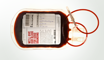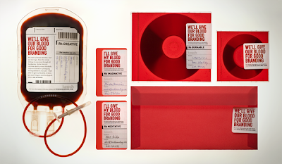

Touch branding created this identity, to send out a message that " every point of communication is a chance to advertise (our) the company".
The identity is a direct mail in a form of a blood bag which is personally delivered to creative directors in ad agencies in Prague
This is a matophor with the designers saying " they would give their blood for good branding "
The word play is being presented by something physical and visual gives it a very high impact to the audience. There is also an element of shock in this project. I think that the concept of this is appropriate to the art directors who see a lot of designs as they work in a creative industry and would be looking to be shocked. I think that these mailshots do a good job.
The layout and format of the additional products such as CD's, business cards and etc are the same as the blood bag giving it consistancy. the use of handwritten labels are effective and gives the design a sense of realism.

No comments:
Post a Comment